World Maps of a Most Unusual Sort
- October 21, 2014
- By Marjorie Frank
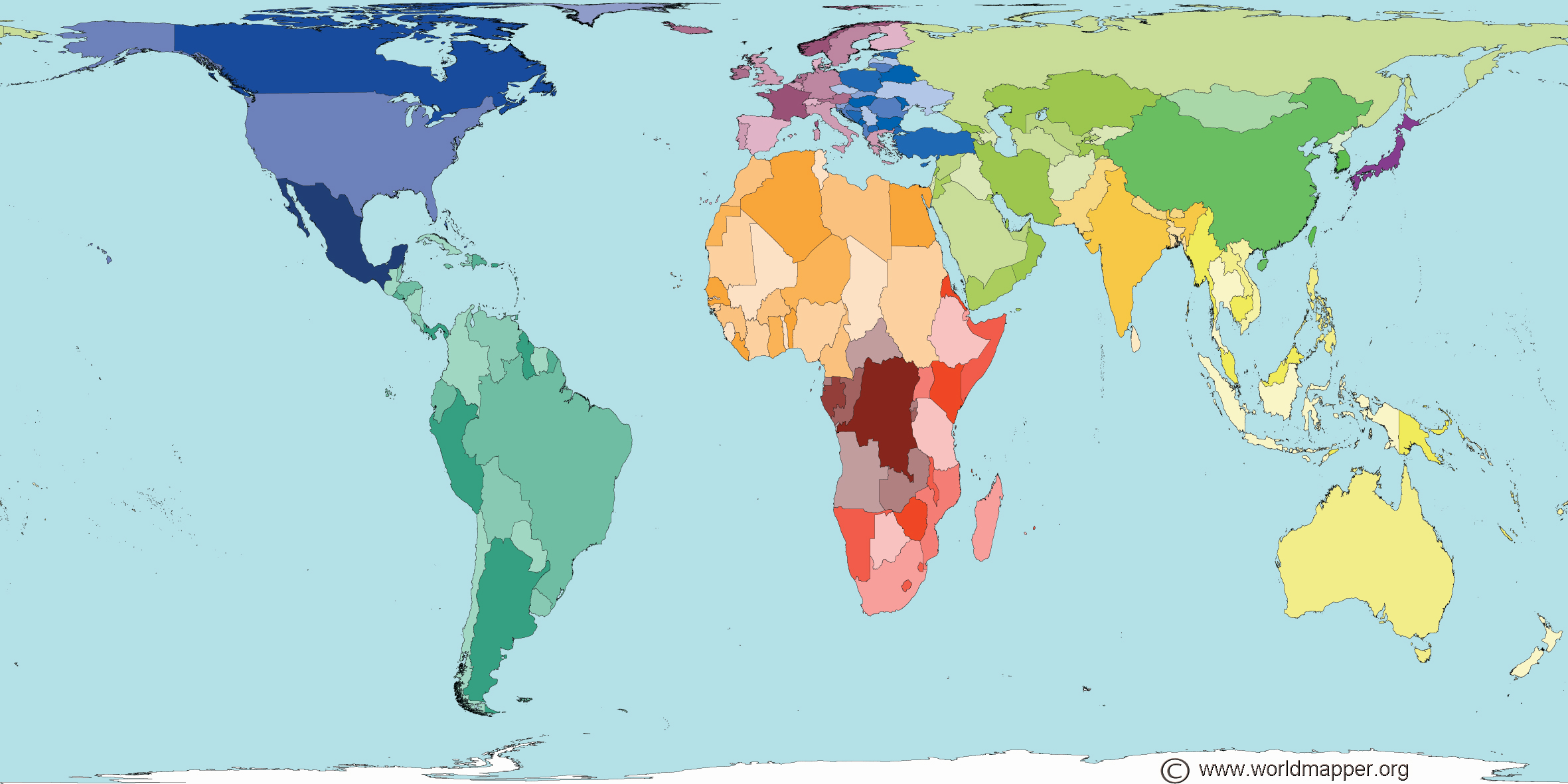
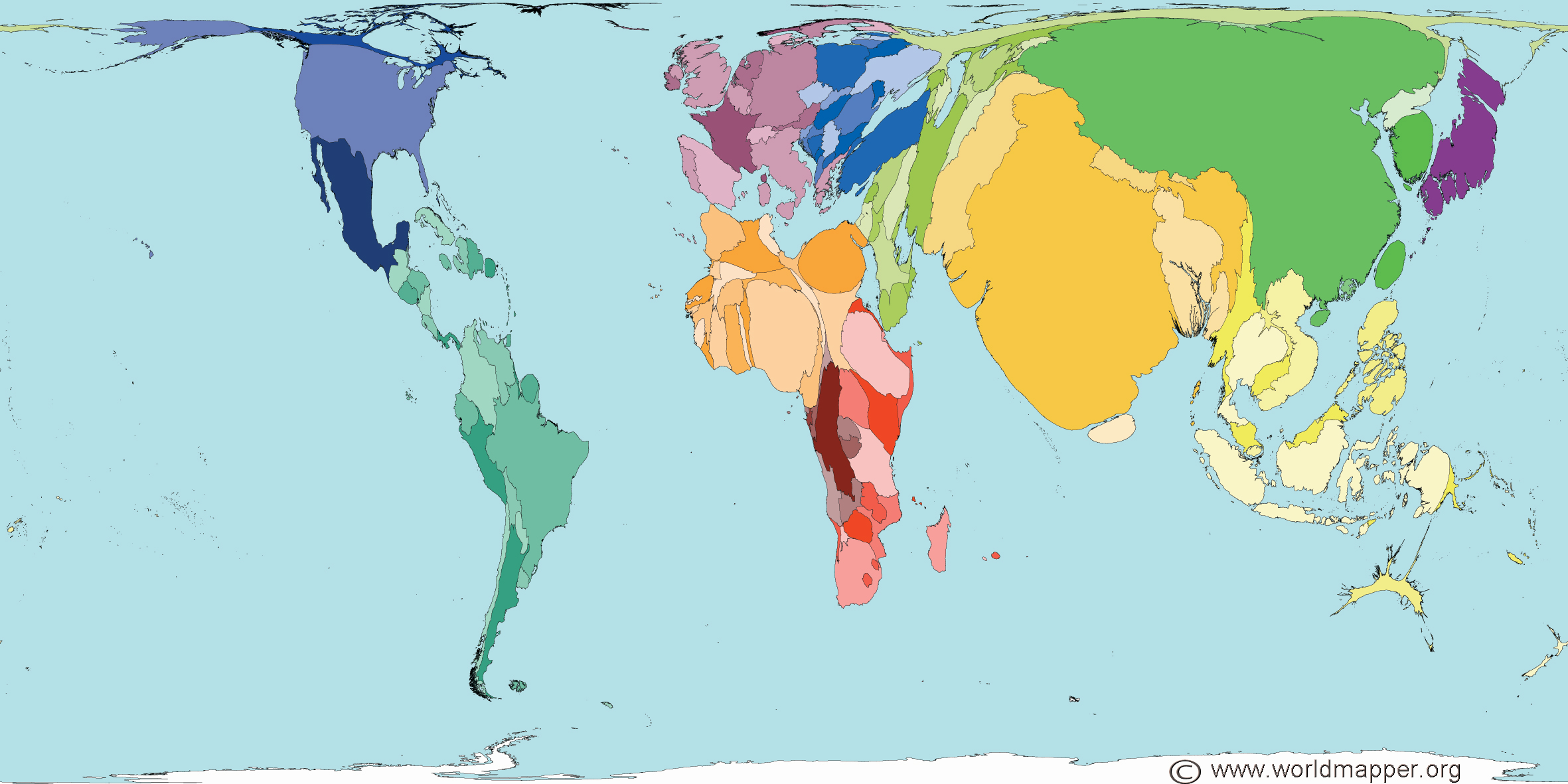
There are all kinds of world maps but what kind of map shows the United States bigger than China? India and North America about the same size? The answer: a Worldmapper map.
Worldmapper.org is home to almost 700 cartograms. A cartogram is a map in which the size of a region or territory is in proportion to data the map shows, whether it’s land area, population, or amphibians. Unlike traditional special purpose maps, which represent data with symbols, such as trees, animals, and other icons, Worldmapper maps use the relative size of an area or territory to show the data…and that’s what gives these maps their unique appearance.
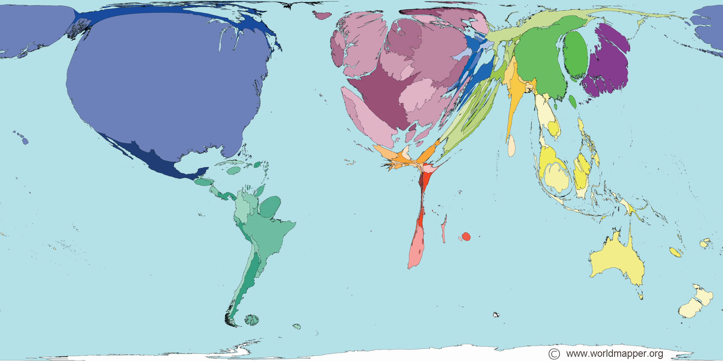
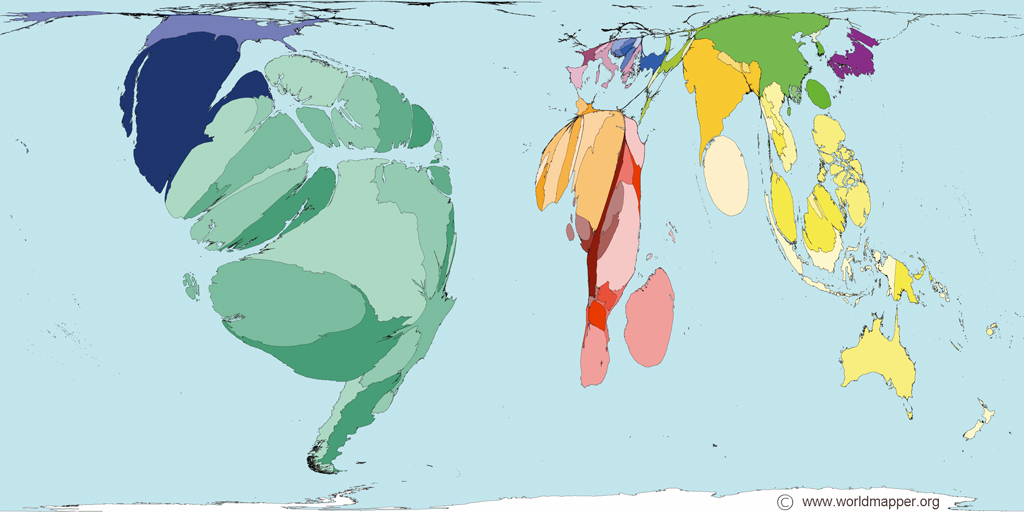
For example, on the map that shows the distance flown by aircraft registered to different countries (Map No. 28), the United States is larger than China, Africa, and South America combined. Why? Because aircraft registered to the United States fly farther than those registered to the other regions. Another example: the world map that shows amphibians at risk (Map No. 275) depicts South America as the largest continent on Earth. Why? Because more amphibians are at risk in South America than anywhere else. You get the idea.
Each map at Worldmapper.org has a companion PDF poster that contains the map as well as bar graphs, explanations and lots more additional information. Best of all, the PDFs are downloadable and free when used for educational purposes. That means us!
For sure, the maps’ bright colors and unusual shapes will capture students’ attention and curiosity. But that’s just the beginning. Once students are familiar with these maps, they can use them to illustrate or launch reports. They can even construct their own.
To get the process started, familiarize students with the maps and the underlying principle. Begin by displaying one of the maps. We’ll use map No. 2, Total Population, as an example.
Ask students if they notice anything unusual about the map. They’ll probably say that the continents and countries are not shown correctly. That’s when you explain that in this map, the size of each territory is connected to its population, not to its land area. So, territories with more people are larger; territories with fewer people are smaller. That’s the general principle, and can be applied to any Worldmapper map.
Challenge students to make observations and draw conclusions about the population of different territories. Since the data is shown graphically, they should be able to compare and rank order territories. They should also be able to identify those territories with more and fewer people than the United States.
For comparison with other eras, display Maps Nos. 8, 9, and 10 in sequence. These maps show the population in 1500, 1900, and 1960. Guide students to describe the changes in population over time.
Sophisticated formulas and algorithms drive the cartograms at worldmapper.org. But students can apply straightforward mathematics to data and create their own cartograms. Since data about the United States is readily available, you might want students to begin there. Here’s a way to do it.
Step 1: Divide students into teams of three or four. Then identify or have teams identify a topic for their map. Topics can coordinate with what students are studying in social studies or history class or another topic, as long as state-by-state data is available. Some possibilities include:
Present population
The length of time each state has been part of the United States
The number of cars
Average yearly rainfall
Oil reserves
Let’s use population as of 2010 (the last census) as an example.
Step 2: Allow time for students to do library or Internet research to find the population of each state. Suggest they keep track of the data in a chart.
Step 3: Have students figure out the relative size of each state based on the data. To do so, they can select the size of one state and make the other states larger or smaller, depending on their population. For example, the state that ranks 25th in population (midway between the most and least populous) is Louisiana with about 4.5 million people. Alabama, South Carolina, and Kentucky have populations in the same ballpark, so these states would be about the same size as Louisiana (regardless of their actual size, based on square miles). New Jersey has about 8.8 million people, so it would be shown as twice the size of Louisiana. New Mexico and Nevada have about half the population, so they would be shown as half its size. Have students add a column to their chart where they can keep track of the relative size of each state.
Step 4: Now students are ready to create their maps. To do so, they can copy or trace the states in the appropriate size. Or, they can download, resize, print, and cut out an image of each state. (clker.com and openclipart.org and are great sources of free downloads.) As with the maps at worldmapper.org, it’s totally permissible to adjust or distort the shape of a state as needed. You may want to encourage students to study the maps at the site to see how it’s done.
Step 5: After students add a title and some color, the maps are finished! If possible, display the maps and allow time for teams to present their work. Finally, discuss the pros and cons of displaying data in this way.
This is a rigorous activity. But the process involves all kinds of essential analytical skills—research, math, applied technology, knowledge of the states—and leads to a result most people will find intriguing and novel. That alone is enough to make the project worthwhile!